Widgets
Outline 💭
Widgets are elements of a user interface.
The user interface defines how people interact with an application, and how the application interacts with people.
Common widgets used to make up a user interface include (but are not limited to):
Activity indicators
An animation showing activity of indeterminate length, usually some sort of "spinner".
Audio players
Play sound files. These may be visible to the user in the form of playback buttons and a progress bar, or may be invisible if playing ambient sounds.
Buttons
Something to press or click to cause some sort of action in the application. Buttons may contain a text label (to indicate what it does) or an image (an icon that represents what it does). They may also be disabled (i.e. visible, but not functioning).
Canvases
An area of the user interface in which one dynamically draws. This is often used as a way to display graphs, charts and other interactive or animated graphical elements.
Dividers
Separators used to visually distinguish different sections of content in the user interface. These usually take the form of lines of a certain thickness and colour.
Email inputs
For typing in valid email addresses. This is usually a text input that only allows the entry of valid email addresses.
Images
Contain pictures to display as part of the user interface. Images can be contained in other widgets, like this carousel.


Labels
Short explanatory / contextual text for annotating other widgets (such as the text of a button, or labels for input widgets).
Maps
Display tile based data. They centre on a location and may have markers, routes or areas highlighted. Maps may also be draggable and zoomable.
Multi-line text inputs
For entering large amounts of text.
Multiple choice selectors
For selecting any items from a list of options. Options are toggled as selected / deselected with a press or a click. More options may be available via the use of a scroll bar.
Number inputs
For typing in numeric input. This is usually a text input that only allows the entry of valid numeric values.
Password inputs
For typing in passwords (without revealing the password on the user interface).
These are text inputs whose value is hidden by place holders for the actual
text (such as "*").
Progress bars
For indicating the progress of a task of known length. As a task progresses events are fired that cause the progress bar to grow.
Scroll bars
For moving around content on the UI that is too big to display in the available space. Scroll bars are usually at the edge of a scrollable area and move both horizontally and vertically. Sometimes they only appear when the user's mouse is over them or a touch event is detected.
Lorem ipsum dolor sit amet, consectetur adipiscing elit, sed do eiusmod tempor incididunt ut labore et dolore magna aliqua. Non nisi est sit amet facilisis magna. Non consectetur a erat nam. Quam quisque id diam vel. Imperdiet proin fermentum leo vel. Neque viverra justo nec ultrices dui sapien eget. Purus faucibus ornare suspendisse sed. Eget felis eget nunc lobortis mattis aliquam faucibus purus in. Nisl nunc mi ipsum faucibus vitae aliquet. Eget mauris pharetra et ultrices. Gravida neque convallis a cras. Risus feugiat in ante metus dictum at. Semper risus in hendrerit gravida. Odio euismod lacinia at quis. Turpis massa sed elementum tempus egestas sed sed risus.
Massa placerat duis ultricies lacus sed turpis tincidunt. Dignissim cras tincidunt lobortis feugiat vivamus at augue. Sit amet nulla facilisi morbi tempus iaculis urna id. Quam viverra orci sagittis eu volutpat odio. Purus viverra accumsan in nisl nisi scelerisque eu. Quam lacus suspendisse faucibus interdum posuere lorem ipsum dolor. Elementum eu facilisis sed odio. Tortor posuere ac ut consequat semper viverra. Erat pellentesque adipiscing commodo elit. Dui nunc mattis enim ut tellus elementum. Nunc pulvinar sapien et ligula. Malesuada fames ac turpis egestas integer eget aliquet. Ut diam quam nulla porttitor. Risus pretium quam vulputate dignissim suspendisse in est. Condimentum id venenatis a condimentum vitae sapien pellentesque habitant. Nam libero justo laoreet sit amet cursus sit amet. Blandit turpis cursus in hac habitasse platea dictumst quisque. Vivamus arcu felis bibendum ut tristique et egestas quis. Diam ut venenatis tellus in metus vulputate eu scelerisque. Dui faucibus in ornare quam viverra orci sagittis eu volutpat.
Tincidunt lobortis feugiat vivamus at augue eget arcu. Sed blandit libero volutpat sed cras ornare arcu. Donec enim diam vulputate ut pharetra. Accumsan tortor posuere ac ut consequat. Condimentum id venenatis a condimentum vitae sapien. Aliquet nec ullamcorper sit amet risus. Arcu dui vivamus arcu felis. Quis hendrerit dolor magna eget est lorem ipsum dolor. Orci dapibus ultrices in iaculis. Duis ultricies lacus sed turpis tincidunt. At ultrices mi tempus imperdiet. Ac ut consequat semper viverra nam libero justo. Metus dictum at tempor commodo ullamcorper a lacus vestibulum sed. Vel pretium lectus quam id leo in. Egestas dui id ornare arcu odio ut sem.
Selectors
For choosing a single item from a list of options. Items are selected / de-selected with a press or a click. If a different item is already selected, it is automatically de-selected in favour of the newly selected item.
or...
Sliders
For selecting a value within a range. The range is usually shown as a horizontal or vertical line, with the selected value as a draggable marker.
Switches
An indicator with two possible states: True (on, checked); and False (off, unchecked). They are toggled via a click or press.
Tables
Layed out with rows and columns, are used for displaying tabular data.
| Name | Age | Vocation |
|---|---|---|
| Albert Einstein | 76 | Physicist |
| Elizabeth Windsor | 96 | Queen |
| Basil Brush | 61 | Fox |
Text inputs
A single line box for typing in short amounts of text.
Trees
For displaying data organised as hierarchical (tree like) items. Trees may allow themselves to be expanded or contracted by toggling parent items, to show or hide their child items.
Video players
For rendering video files to the user interface. These will usually include playback control buttons and a progress bar.
Some of the widgets are presentational - they display or make available certain sorts of media or data. Other widgets are interactive - the user affects change in the application via gestures, clicks and other activities.
Widgets subscribe to messages and automatically update their media and data when such messages are published.
Widgets are organised into containers. Containers may contain other containers. As a result, widgets and containers will always have a parent container. A container's widgets and containers are called its children.
Containers define the formation and layout to use to show their child widgets and containers to the user.
Such arrangements, that stress how things appear in relation to each other, ensure the software is able to compute the precise layout of the user interface given different types of device (mobile, tablet or desktop) and orientations (portrait or landscape).
There are several different types of container:
- Box - a generic container for widgets or containers.
- Tab box - a container of containers that allows the user to select which child container is displayed depending on a tab control.
- Split box - a container of containers between which a moveable split is shown so the user can change the relative sizes of the child containers.
- Scroll box - a container, with a specified height or width, that may contain content larger than the available display size. Vertical and horizontal scroll bars my be used to make visible different areas of the content in the available display area.
All containers are oriented in one of two ways:
- Vertical - that displays its children vertically one after the other.
- Horizontal - displays its children horizontally side by side of each other.
All containers also have a direction associated with vertical or horizontal orientations.
- Vertical - starting either from the top to the bottom or other other way up, from the bottom to the top. Default: top to bottom.
- Horizontal - starting from either the left to the right, or the other way around, from the right to the left. Default: left to right.
Containers are drawn onto cards. A card is an individual screen in an app.
Example use 🤖
The following code creates a form for entering a postal address, containing several containers and widgets. The textual description of the form can be updated via messages to the "address_instructions" channel, because the widget that represents the instructions subscribes to this channel.
import invent
from invent.ui.widgets import Label, TextInput
from invent.ui.containers import Box, VERTICAL, HORIZONTAL


# Create a parent box to hold the rest of the form.
address_form = Box(VERTICAL)

# Create some instructions to put at the top.
instructions = Label("Please fill in your address.")
# Because the instructions could change (e.g. if the address is invalid and the
# user needs to know they should correct it), then subscribe the textual
# content of the instructions to the "address_instructions" channel.
invent.subscribe("address_instructions", instructions.text)

# Each of the entries in the address is a label, a textual input and a
# horizontal box to contain them.
name_label = Label("Name:")
name_input = TextInput()
name_container = Box(
    HORIZONTAL, children=[name_label, name_input, ]
)

number_street_label = Label("House number / street:")
number_street_input = TextInput()
number_street_container = Box(
    HORIZONTAL, children=[number_street_label, number_street_input, ]
)

town_label = Label("Town:")
town_input = TextInput()
town_container = Box(
    HORIZONTAL, children=[town_label, town_input, ]
)


postcode_label = Label("Postcode/Zip:")
postcode_input = TextInput()
postcode_container = Box(
    HORIZONTAL, children=[postcode_label, postcode_input, ]
)

# Add all the parts of the address form into the address container.
address_form.children = [
    instructions,
    name_container,
    number_street_container,
    town_container,
    postcode_container,
]
Teaching points 🗣️
Learning / understanding outcomes:
- Widgets are common UI elements like buttons, dropdowns, image viewers, video players...
- Widget attributes may subscribe to messages so they auto-update.
- Containers contain widgets and other containers as their "children". They define the widget's formation and layout.
Widgets are to the user interface of an application, as knobs, switches and indicator lights are to, say, a kitchen appliance. They are a way to transmit information from the application to the user (by displaying media and data) or from the user to the application by manipulating or interacting with widgets.
Since widgets are instantiated in some way (for example, they're drawn on the screen, or they're playing sounds), a great deal of thought and talent can be invested in how people and applications interact. This field of computing is called Human Computer Interaction (HCI) and encompasses design, psychology, learning, cultural studies, linguistics, security, sociological research and deeply technical work. Many disciplines outside the field of computing can be brought to bear through HCI. For instance, one of the foundational texts in HCI discusses how the user interfaces of applications are a form of theatre, and many musicians spend time composing fragmentary pieces, that often last less than a second, but which are used to indicate something has happend (such as an alert for a new email).
Most importantly, when designing a user interface by assembling widgets and containers it is important to do so with empathy, compassion and collaborative communication... you need to know your user interface is engaging, fulfils its purpose and relates to the people you imagine will use it. That's why it's essential to place human beings, their culture and social interactions at the heart of such work.
Unplugged activities 🔌
These two unplugged activities help secure the notion of "widgets" and model the way containers form and layout widgets in the user interface.
The widget cafe ☕
This unplugged activity highlights how the design of something influences your interaction with it.
How do you make a cup of coffee? Here are three videos that show you different ways.
Before watching them, tell learners to ask themselves:
- Which technique produces the best coffee?
- What are the pros and cons of each technique?
- For whom is each technique created?
After watching, engage in a discussion with the aim of answering:
- What were the creators of each technique thinking?
- How might you rank each technique?
- Why so many coffee making techniques?
Team formation ⚽
This unplugged activity explores how items are arranged in space. This is an important consideration, because widgets are arranged into containers in exactly the same way.
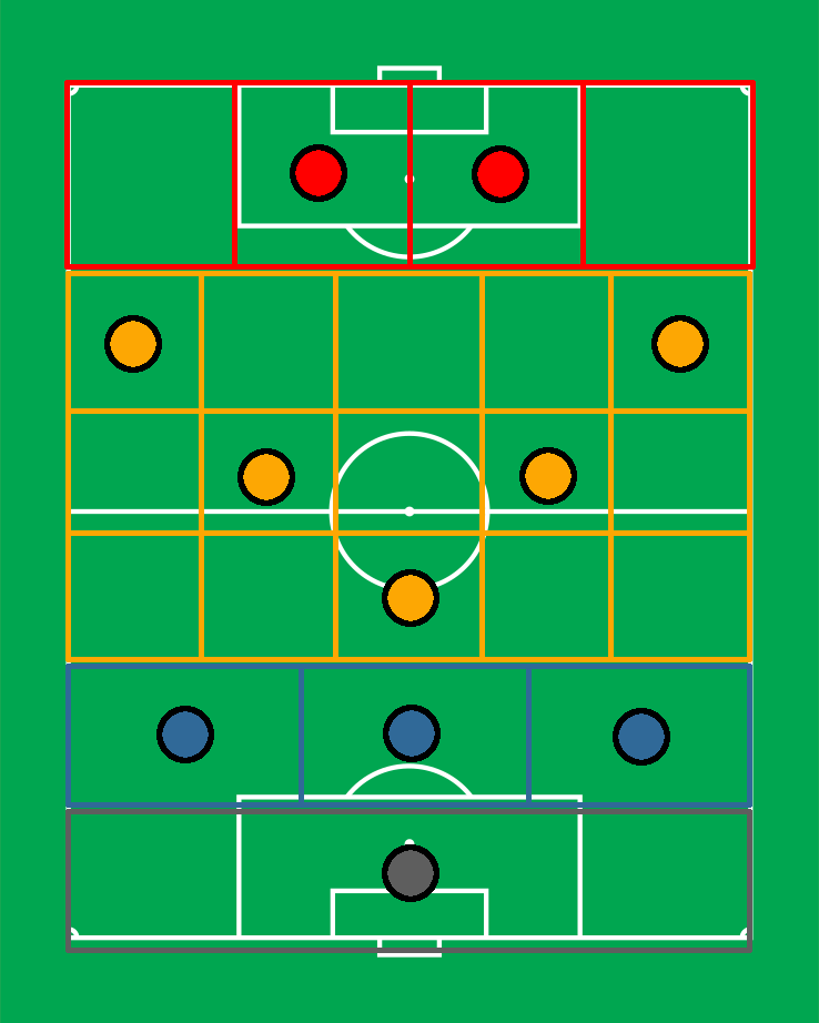
This is an image of some coloured tokens. It doesn't really matter what the tokens represent at the moment, just that there are different tokens arranged into some sort of a pattern.
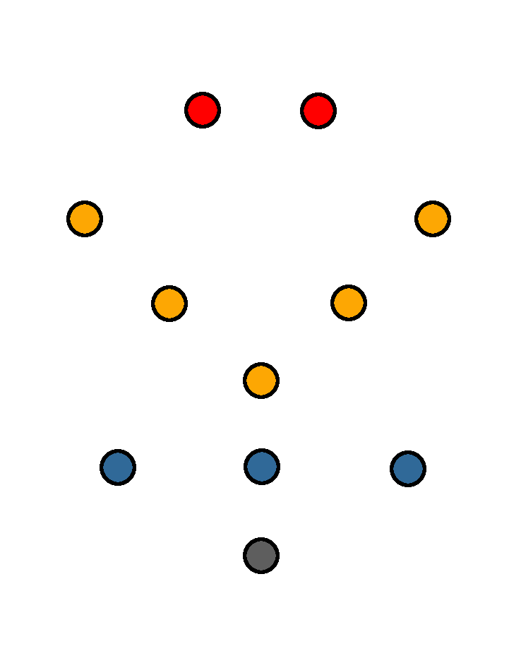
Actually, these tokens represent players on a football team. The red tokens are for strikers, yellow for midfield, blue for defenders and grey for the goal keeper.
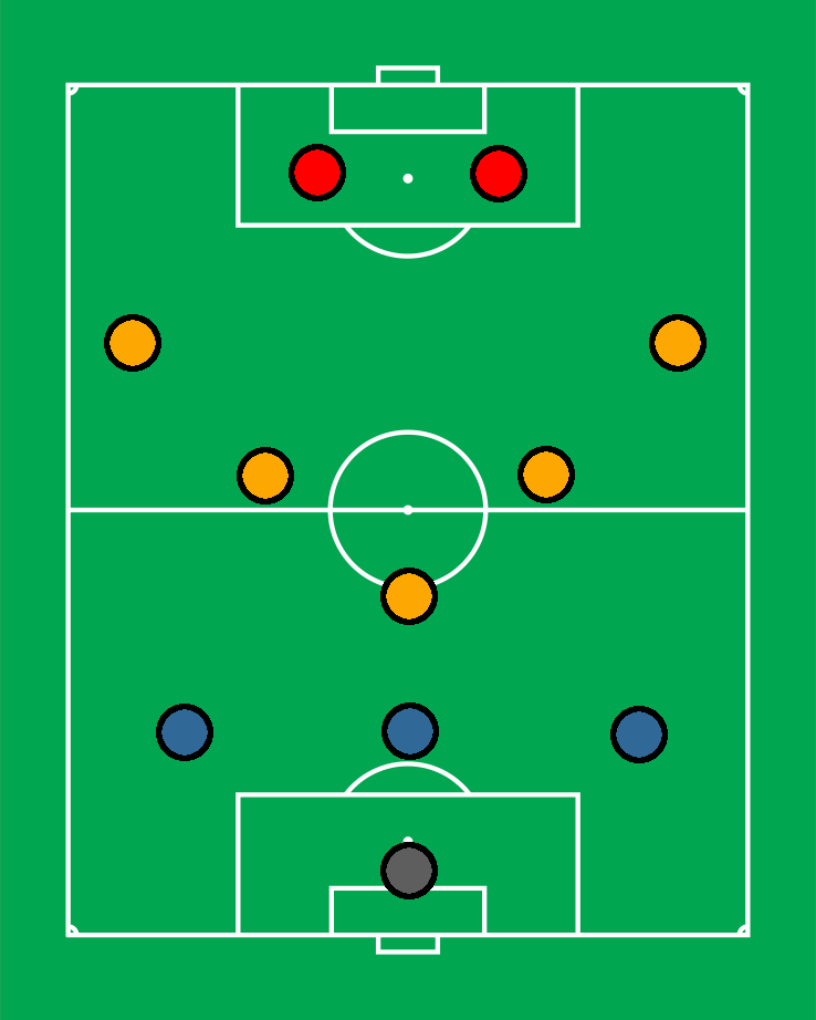
Notice how the team is arranged to cover the whole pitch, with plenty of space for them to pass the ball.
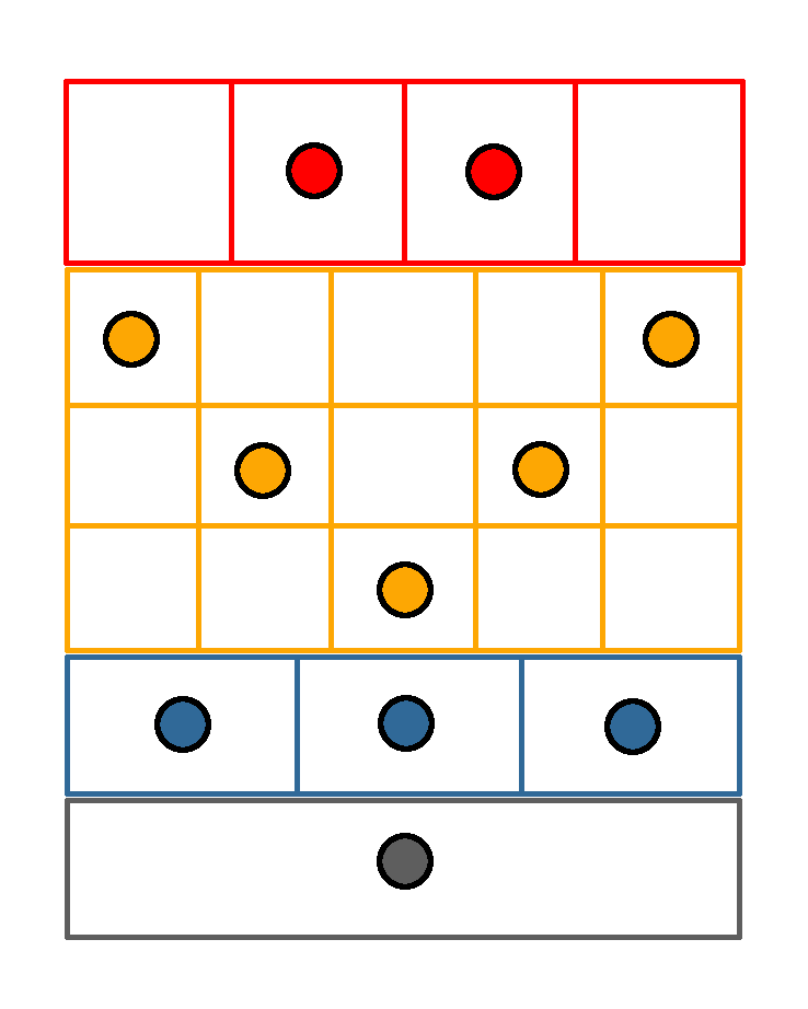
But sometimes, their opponents put pressure on them and the team responds by modifying their formation: it's squashed so the midfield becomes a single line immediately in front of the defenders with the strikers pulling back to assist.
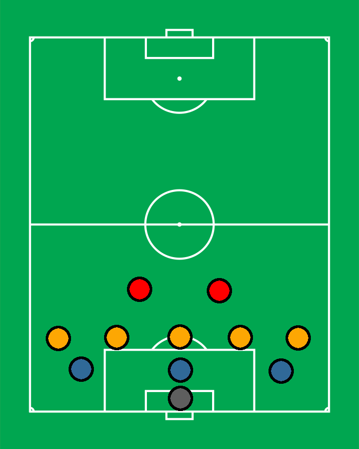
The football team responds to the change in the situation by changing from a portrait (tall) to landscape (wide) arrangement while retaining the same basic formation. In computing, this is exactly what we mean by "responsive" design: how the page is arranged depending on if the view is in portrait or landscape mode.
In a sense, a football manager lays out the team on the pitch in the same way that widgets are arranged into containers on a page:
The pitch is a vertical container with four rows, each holding a further container. The striker's container is horizontal containing four equal sections, the midfield is itself a further vertical container holding three horizontal containers of five equal sections, the defence is a single horizontal container of three equal sections, and the goal keeper's container is a horizontal container of one section. Each player has a designated container into which they are centred.
If we remove the pitch so only the grid and coloured tokens remain we have a plan for the layout of a screen in an application.
Adding the grid back, and replacing tokens with actual content for a kitten photo sharing app (while keeping the containers and arrangement exactly the same), gives this:
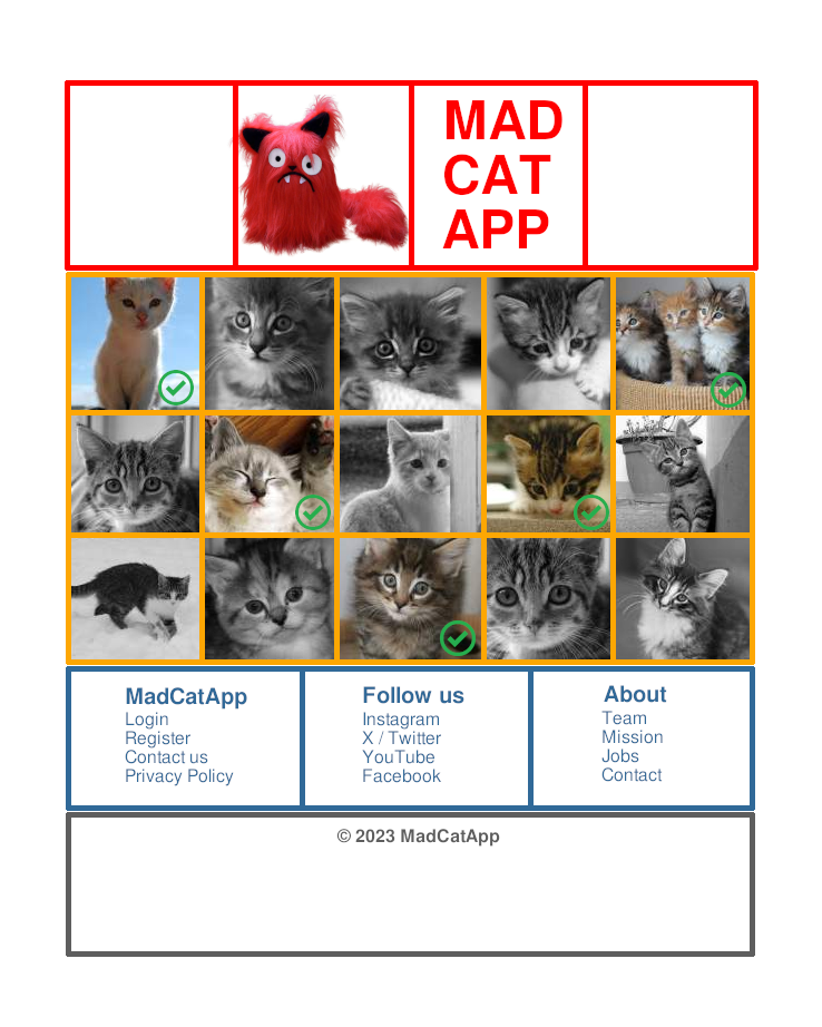
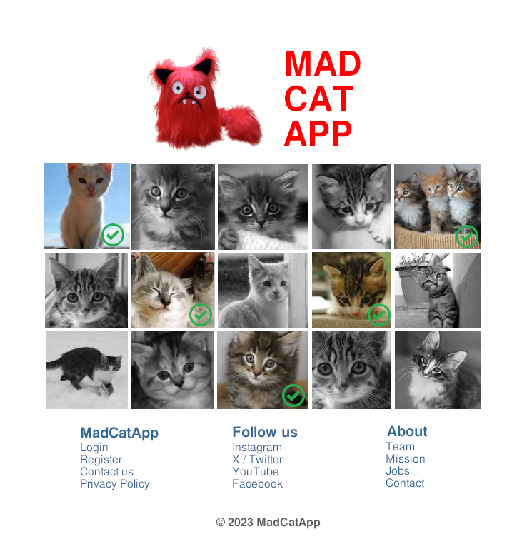
Without the grid, it looks like a convincing app. But notice how the different widgets on the application are arranged in invisible grids of horizontal and vertical containers.
Ask learners to use a similar system of arranging widgets into grids of horizontal and vertical containers. Give each group a different type of app. For example:
- To-do list.
- Social media timeline.
- Image editor.
- Instant messenger.
- News feed.
- Homework tracker.
- Office app (text editor).
Getting to know you 👥
Code runs our world. Yet code isn't written for computers.
We write code because we are human beings imbued with ideas, imagination and feelings. Code expresses our thoughts made digital: a medium for our values, cultures and ways of life.
In other words, code reflects who is writing it, and for whom it is for.
This unplugged activity encourages learners to develop much needed empathy and compassion for folks interacting with or creating apps.
As they watch these three videos, ask learners to pretend that the fantasy characters found in the clips are either coders (who make apps) or owners of a device upon which they can run an Invent app.
To foster a classroom debate:
- What sort of app would a Balrog make?
- As a magician, what apps does Gandalf have on his phone?
- What app would Ken write for Barbie?
- If every day in BarbieLand is the same, what apps do folks use?
- How does "the doctor" explain his device to the other characters?
- Is it even useful (it goes ding when there's stuff)?
- Are there any unforeseen side effects?
Next, choose two different but favourite characters from film, TV or books. Learners are to prepare a presentation to introduce an app that character 1 is created for character 2 (and you choose what that app is). For example, Justin from Stranger Things designs a music streaming app for imperial storm troopers from the Star Wars universe.
When giving their presentation learners need to make sure:
- They explain each character's perspective.
- Will any of the characters encounter problems.
- What approach does the app creator take?
- The app recipients will have opinions... what might they be and how might you find these out?
- Bonus points for imagination, creativity and a sense of fun.
- Most importantly, learners need to show they can stand in the shoes, empathise with and act in a compassionate way towards both the creator and user of the app they design and present.